Flutter & Fall
UK Butterfly Populations
1976-2024
Year
2026
Explore the visualisation here on your desktop browser.
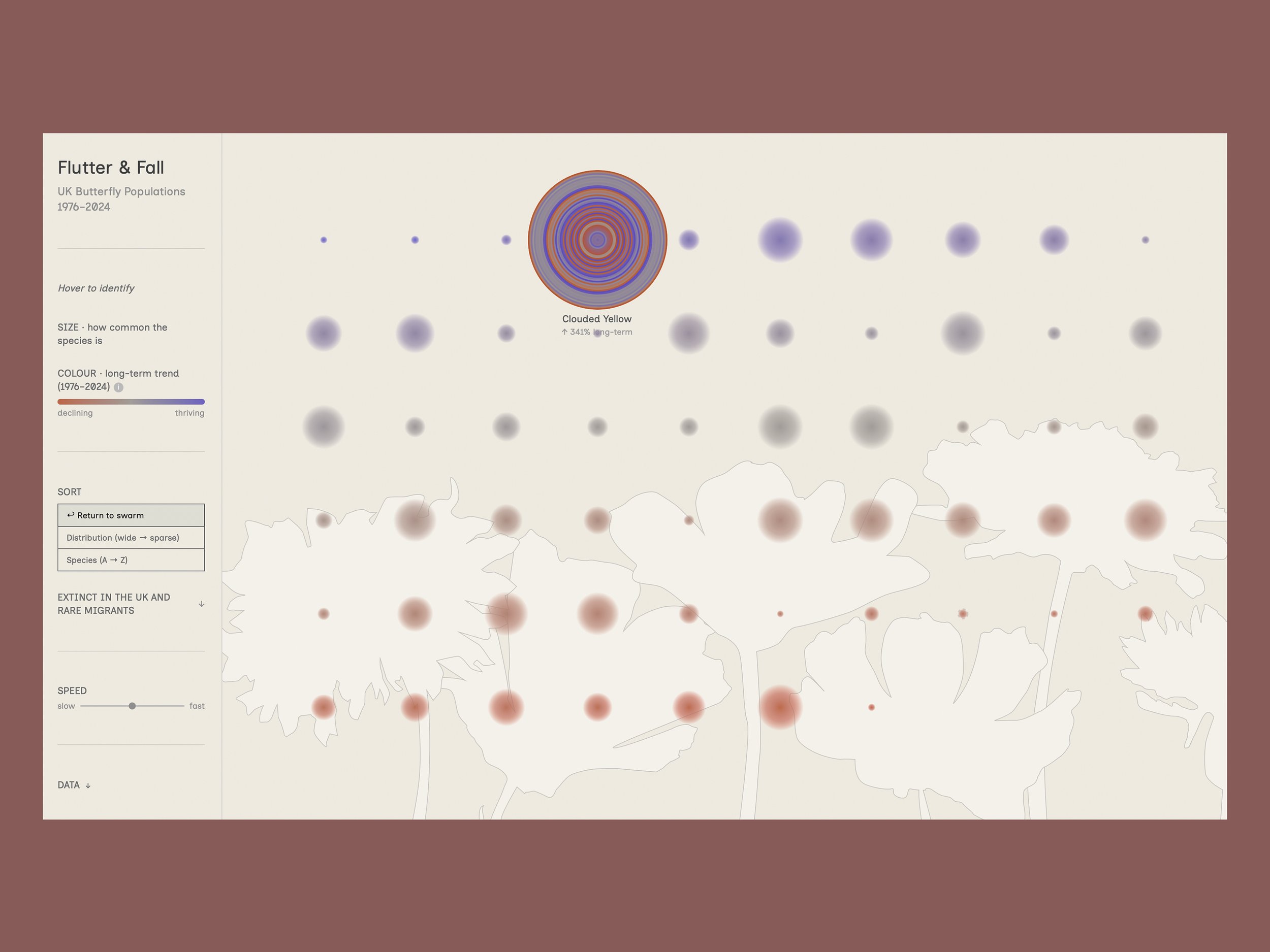
Flutter & Fall demonstrates the potential of interactive data visualisation to bring ecological research to new audiences, and is particularly relevant for conservation organisations, research institutions, and environmental communications.
A self-initiated interactive data visualisation exploring nearly 50 years of UK butterfly population data, translating scientific monitoring records into a visual form that communicates the scale of population change across 60 resident species.
Challenge:
UK butterfly populations have undergone dramatic change since systematic monitoring began in 1976 — some species declining by more than 80%, others recovering significantly through targeted conservation. The scientific data behind these stories is robust and detailed, held within specialist datasets and technical reports. The challenge was to find a visual form that could communicate the scale and diversity of these changes in a way that creates an emotional response, and rewards deeper exploration without oversimplifying the underlying data.
Approach:
Flutter & Fall draws on three primary datasets published by the UK Butterfly Monitoring Scheme (UKBMS) and the Global Biodiversity Information Facility (GBIF): species-level long-term population trends from 1976–2024, year-by-year abundance indices, and geographic range data drawn from occurrence records across the UK.
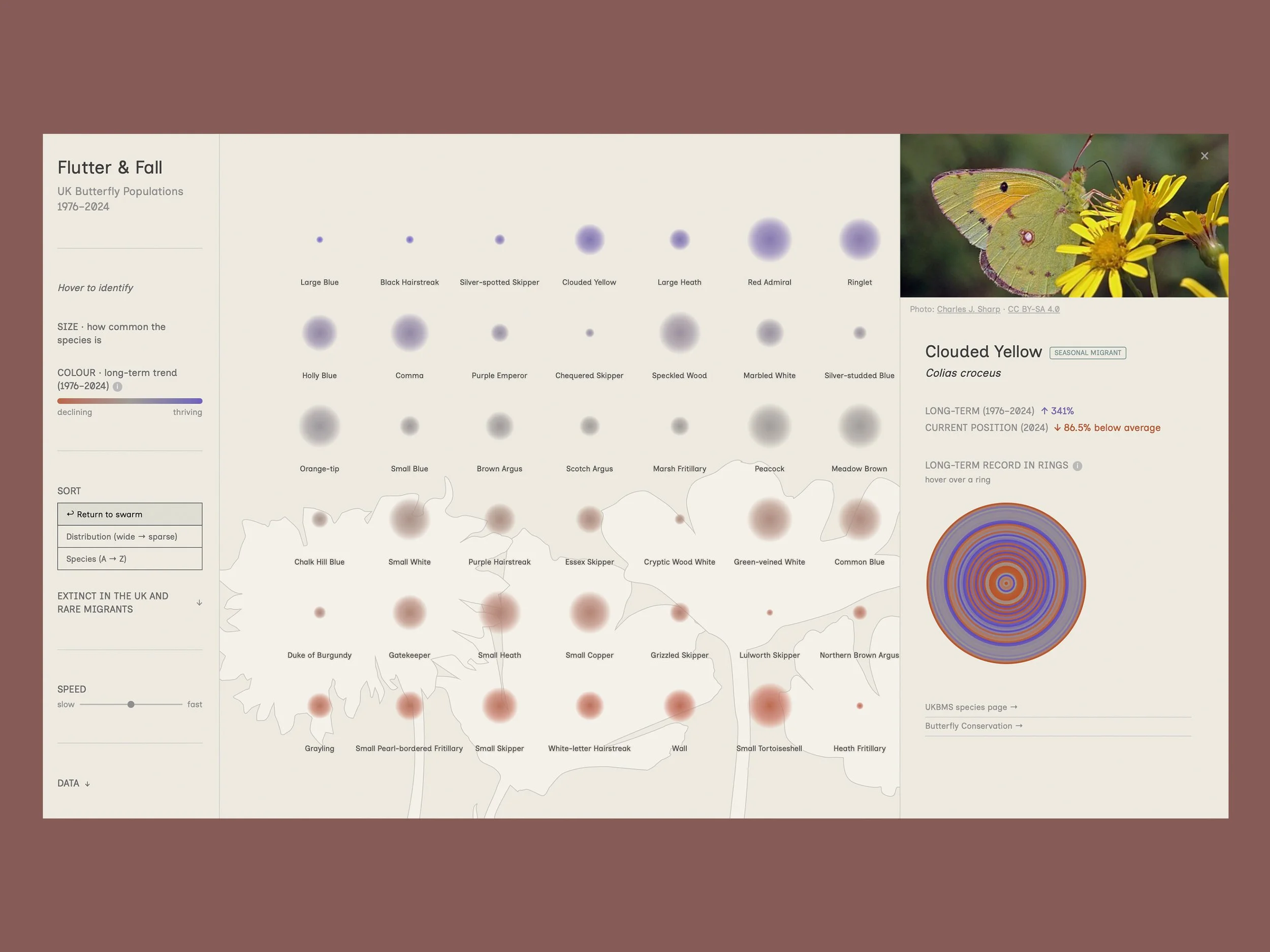
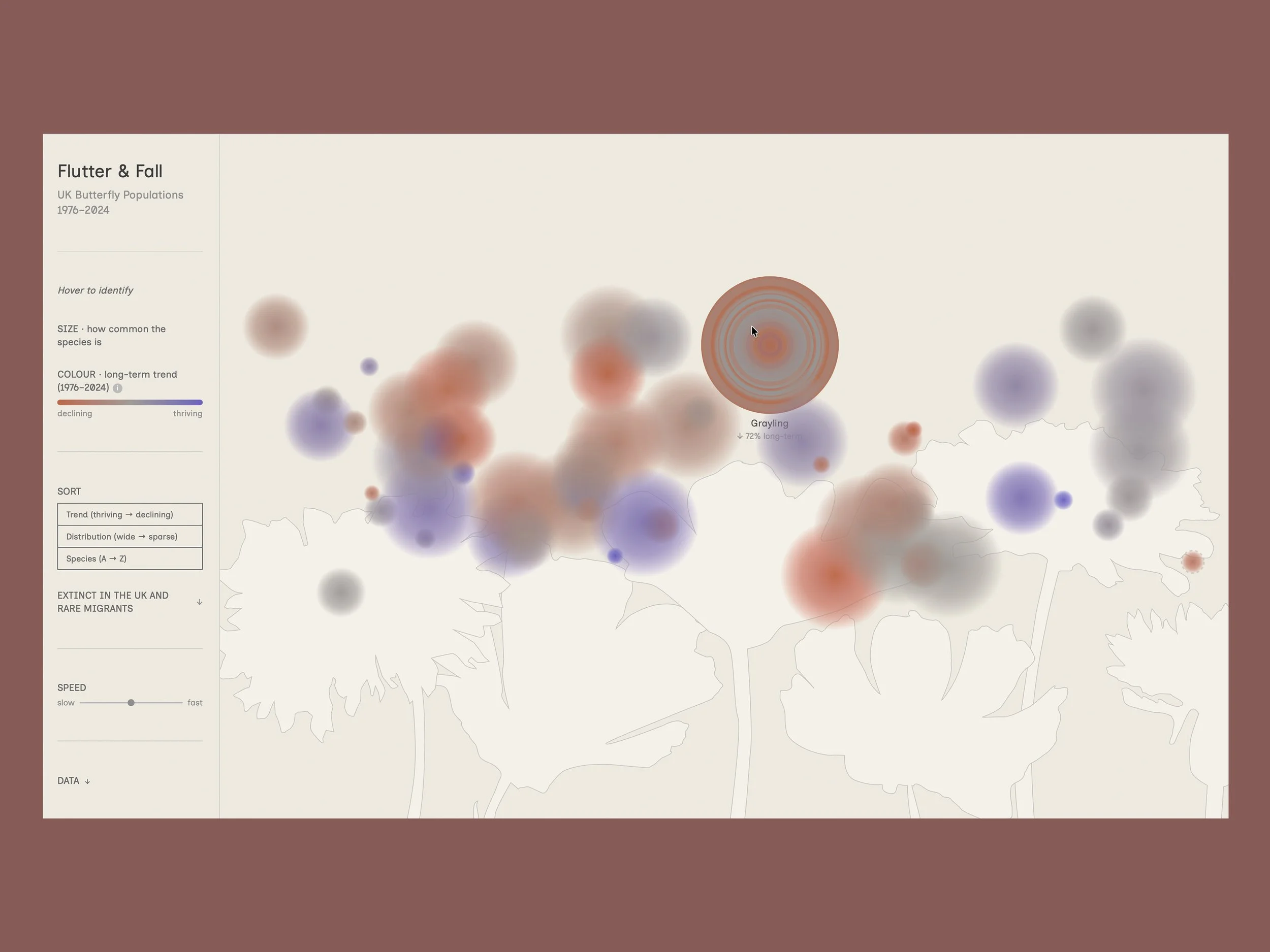
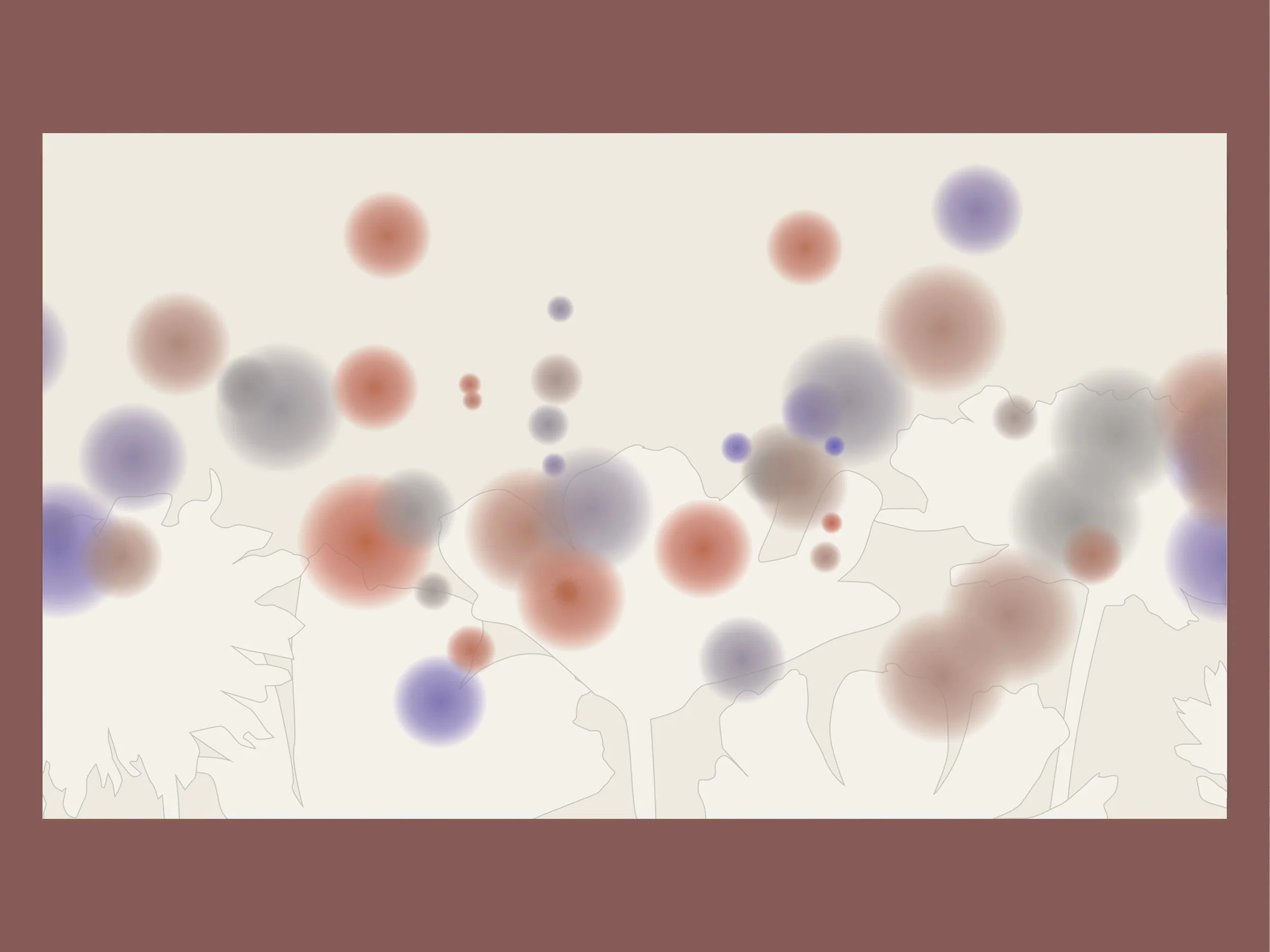
Each of the 60 resident UK butterfly species is represented as a floating orb. The size of each orb encodes geographic range (the number of 10km grid squares across the UK the species was recorded in), communicating relative commonness or rarity at a glance. The orb colour encodes long-term population trend on a continuous scale from deep red (decline) through a neutral warm grey (stable) to deep blue (increase). The scale has asymmetric caps indicating the that populations can decline to extinction but have no upper limit on recovery.
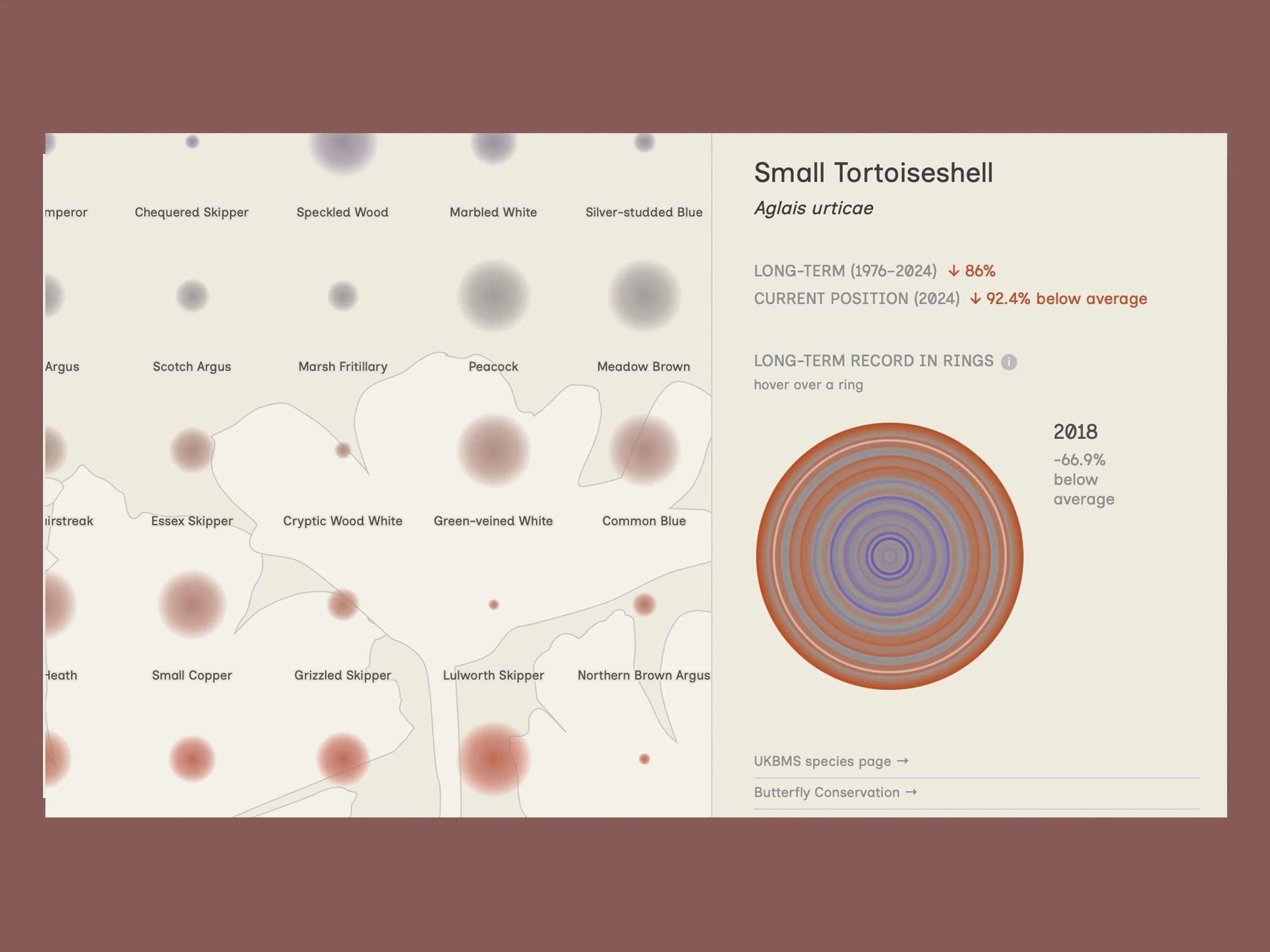
Clicking any species opens a detail panel showing its annual population record as concentric rings, each representing one year and coloured by how that year compared to the species' own long-term average.
The data was pre-processed and transformed in R. The visualisation was built in D3.js using an AI-assisted ('vibe coded') process.
Data:
GBIF.org (2026). GBIF Occurrence Download. https://doi.org/10.15468/dl.2fhtt
Output:
Interactive web visualisation, accessible at flutter-and-fall.netlify.app
Outcome:
The resulting visualisation presents all 60 species simultaneously, their collective presence on screen communicating the diversity and complexity of the UK butterfly population, while individual exploration reveals the specifics of each species' story over time.
Visualisation / Data visualisation / Data-informed visual communication